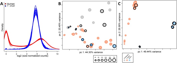
Fig 2. Combined statistical evaluation of all samples used in comparative transcriptome analysis.
A. Density Plot showing the estimated underlying distribution of abundance of reads mapping to each gene feature in the corresponding annotation files. Data is shown for all human (red) and parasite (blue) samples from this study (Sylvio and Y) as well as the Y strain dataset from our previous study [26]. Principal Component Analysis (PCA) of all human (B) and parasite (C) samples following low count genes removal, quantile normalization, and accounting for batch effects in the statistical model. Parasite data was limited to the set of 4,659 single-copy core genes shared between Sylvio and Y strains. Time (hpi) is represented by increasing size of circle. Infection status and strain is depicted by color of circles. Circles with a black ring identify datapoints produced in this study.

