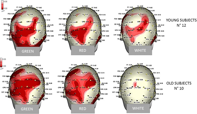
Fig. 10.

Statistical Probability Maps representing the results of the Bonferroni test comparing the P3b amplitude by the different target stimuli with the response obtained by standard stimuli in single groups. The red colors represent the significant p values
