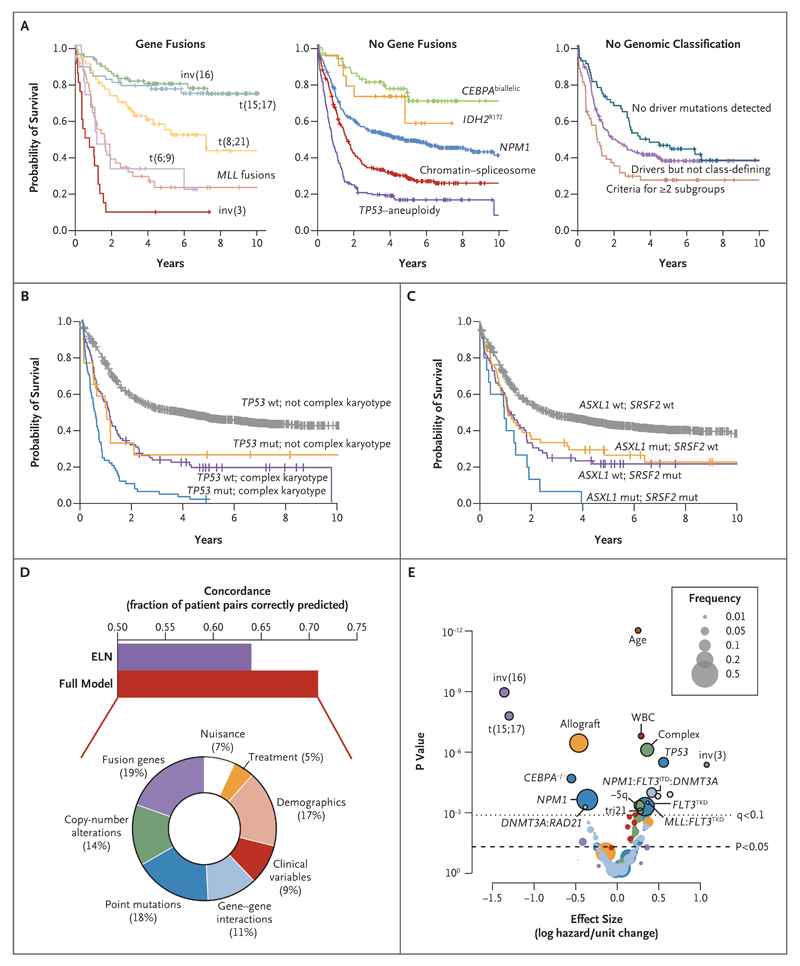
Figure 3. Molecular Subclassification and Overall Survival.
Panel A shows Kaplan–Meier curves for overall survival among patients in the 11 genomically defined subgroups and patients who did not have a straightforward classification. Panel B shows Kaplan–Meier curves for overall survival with the additive and independent prognostic effects of TP53 mutation and complex karyotype (TP53 mutation, 17 patients; complex karyotype, 89; and TP53 mutation with complex karyotype, 70). Panel C shows Kaplan–Meier curves for overall survival with the additive and independent prognostic effects of ASXL1 and SRSF2 mutations (ASXL1 mutation, 55 patients; SRSF2 mutation, 74; and ASXL1 and SRSF2 mutations, 15). In Panels B and C, wt denotes wild type, and mut mutation. The bar chart in Panel D shows concordance estimates for overall survival with the use of variables selected in our model (concordance, approximately 71%) as compared with a model using variables considered in the ELN guidelines (concordance, approximately 64%). The doughnut chart shows the relative proportion of explained variance in overall survival in the full model that is accounted for by different categories of predictor variables. Clinical variables are performance status, splenomegaly, bone marrow blasts, and blood counts. Demographic variables are age and sex. Nuisance variables are other variables (e.g., which trial a patient was enrolled in, what year a patient entered the clinical trial, and whether cytogenetic data were missing). The volcano plot in Panel E shows the incremental contribution to the effect size (expressed as the logarithmic hazard on the x axis; positive values indicate a worsening effect) versus P values (expressed on an inverted logarithmic scale on the y axis) for each of the 228 variables included in the random-effects model. The circles above the dotted line represent 18 variables with a q value of less than 0.1; the size of each circle corresponds to the frequency of the variable, as indicated in the box. The incremental contribution of age is shown for every 10 years of age, and the incremental contribution of the white-cell count (WBC) is shown for each increase of 1×10⁹ cells per liter. The colors of the circles correspond to the colors shown in the doughnut chart in Panel D.

