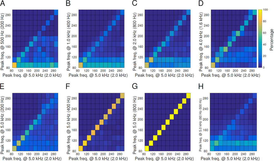
Figure 5. Smearing matrix comparisons.
These plots show how the calculated peak frequency changes when the same data are acquired at different settings. The gold standard is along the x-axis, while the detected parameters are along the y-axis, i.e. horizontal is the true peak frequency, vertical is the perceived peak frequency. The ideal case is in G, in which HFOs of all frequencies in the gold standard are correctly detected, forming a diagonal line. Conversely, the other plots have a percentage of HFOs of every frequency that are incorrectly interpreted as having lower peak frequency. Lower sampling rate (A-D) disrupted peak frequency, as did adding a bandpass filter (H). Lower AAF (E-G) had minimal effects for AAF ≥400 Hz. AAF position is noted in parenthesis after the sampling rate. In vertical pairs A&E, B&F and C&G the AAF is the same with different sampling rate. The colorbar for all plots is shown next to D; all panels are normalized so that each column sums to 100%.

