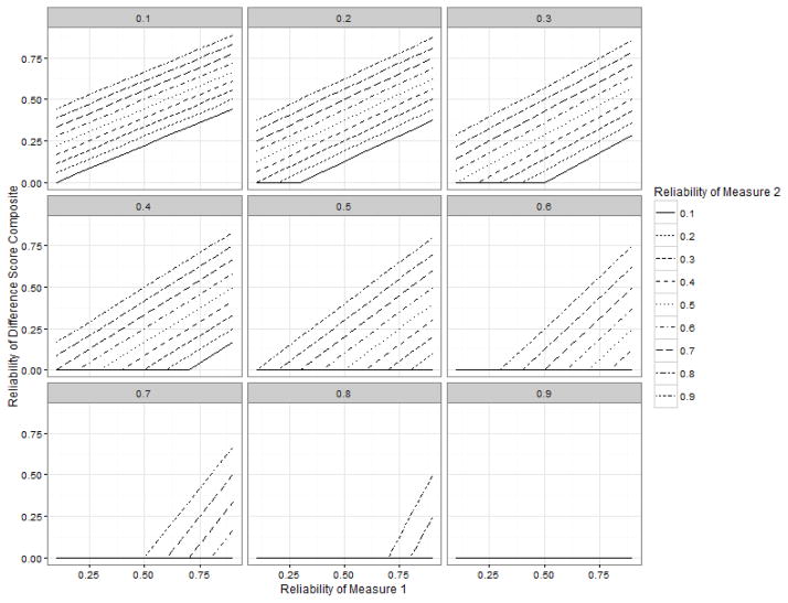
Figure 3.
Demonstration of the impact of a positive correlation between measures on a difference score composite. As in the text, it is assumed that the measures are standardized (i.e., z scores). Each panel represents a correlation between the two measures, from .10 to .90. The reliability of the hypothetical measure 1 is given along the x axis, and the reliability of a hypothetical measure 2 is given by line type. The top line in each panel is always a reliability of .90, with descending line types representing .80, .70, etc. This is because when measure 2 has a reliability of .9, the reliability of the composite is always higher than when measure 2 has a reliability of .8, etc. The reliability of a resulting difference score is given along the y axis. In some cases some (or all) line types do not appear because the reliability of the difference score would be estimated to be at or below zero. This plot was created with the R package ggplot2 (Wickham, 2009) with the help of Scott Baldwin.

