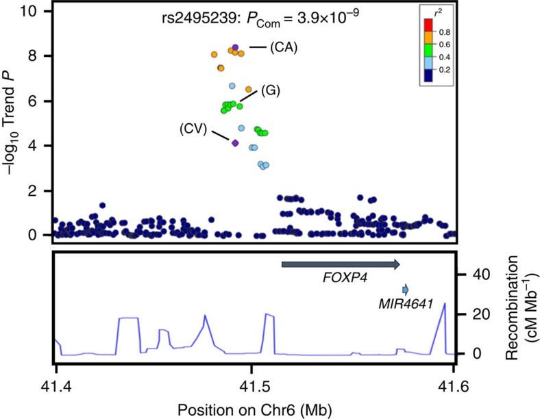
Figure 2. Regional plot of variations in the FOXP4 region.
The marker SNP is shown in purple and the r2 values for the other SNPs are indicated by different colours. Correlations were estimated using data from the 1000 Genomes Project. Genes within the region of interest are annotated and are indicated by arrows. The blue lines indicate the recombination rates in centimorgans (cM) per megabase (Mb). Circles represent the location and –log10 (PTrend values) of each variant. The –log10PTrend values of the marker SNPs are shown for the GWAS (G), the combined validation study (CV) and the total combined study (CA).

