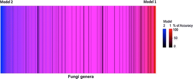
Fig. 4.

Heat map through the 510 common fungal genera of the selected models 1 and 2. The data (genera in the X axis) represented by lines were organized according to model performances. The left side shows genera with the best prediction by model 2 (blue) and the right side indicates those with better accuracies by model 1 (red). The intensity of blue and red colors indicates the percentage of accuracy of the model 2 and 1, respectively
