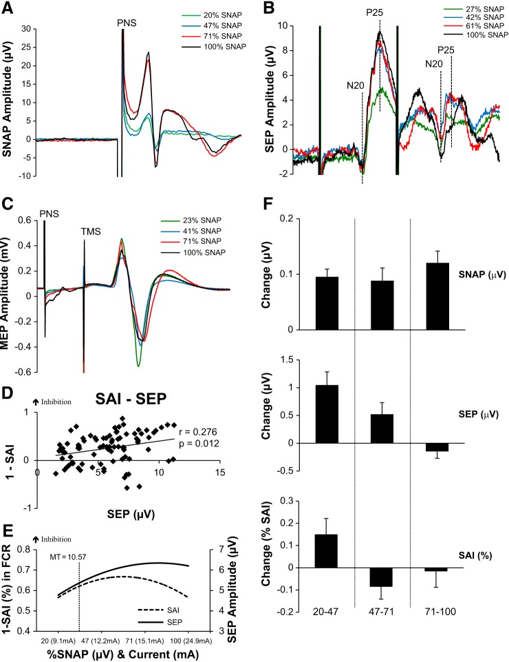
Fig. 1.
Median nerve stimulation. A: average SNAPs recorded from 1 individual at each intensity of median nerve stimulation. Timing of peripheral nerve stimulation (PNS) shown. B: 1ndividual SEP traces depicting N20-P25 amplitude of SEP 1 and SEP 2. Actual percentages of SNAPmax for this participant are shown in the key. C: individual SAI traces with actual %SNAPmax for this participant. D: correlations between SAI and SEP 1 reveal a significant positive correlation; as SEP increases SAI increases. E: second-order polynomial trend lines of the recruitment curves for each measurement are shown to represent how each measure responds to the increases in SNAP. Represented on the graph is the group-averaged motor threshold (MT) and its location on the recruitment curves. As indicated, MT lies slightly below the saturation point and may not allow increases in these measures to occur. Additionally, visually all 3 measures show the saturation occurring at ∼50% of the SNAPmax. F: the group-averaged % change (±SE) in between each block of stimulation intensity for the SNAP, SEP, and SAI. SNAP increases in each increment as depicted by the positive % change, although SEP and SAI reverse and actually show a decrease indicating that they are no longer increasing as the sensory afferent volley increases.

