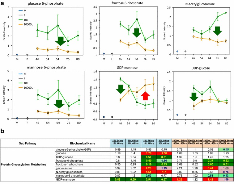
Fig. 6.

Line plot graphs from 10 L (green line) 10,000 L (orange line) scale and the corresponding heat map table showing metabolites related to protein glycosylation pathways. a Line plots graphs of the glycosylation pathway related intermediates comparison between scales. b Heat map table. The heat map tables are color coded, and descriptions are shown in Additional file 1: Figure S1. The intermediates measurement and data analysis were determined as described in “Methods” section. Error bars represents “mean ± one standard deviation”. “M” and “F” in the time axis for every line plot stand for medium and feed samples, respectively
