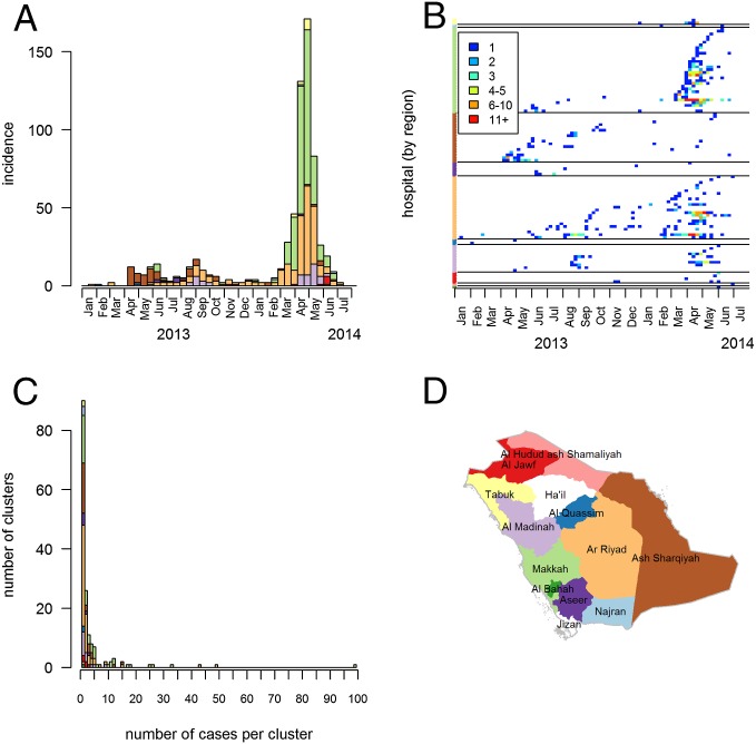
Fig. 1.
The epidemic of MERS-CoV in KSA between January 1, 2013, and July 31, 2014. (A) Biweekly number of MERS-CoV laboratory-confirmed infections per region. (B) Weekly number of cases in the different hospitals and over time. The color of dots indicates the weekly number of cases. Colors on the y axis indicate the region of the hospital. (C) Distribution of the number of cases per cluster. (D) Map of the KSA. Colors in A, B, and C match the color of regions in D.

