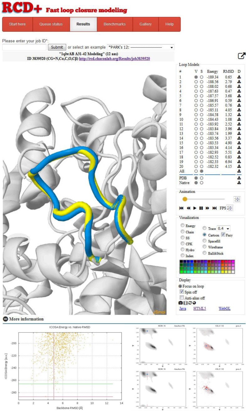
Figure 2.
Sample results page provided by the server for a bacterial hydrolase loop (PDB-ID 1qwl). In this case, for validation proposes only, the native loop (yellow) is displayed superimposed with the predicted lowest energy model in the JSmol visualization panel. On the right, the 20 top-ranked loop models are sorted by energy and can be easily selected to activate visualization and customize representation. The RMSD versus ICOSA energy plots and the Ramachandran distributions are shown in the bottom part.

