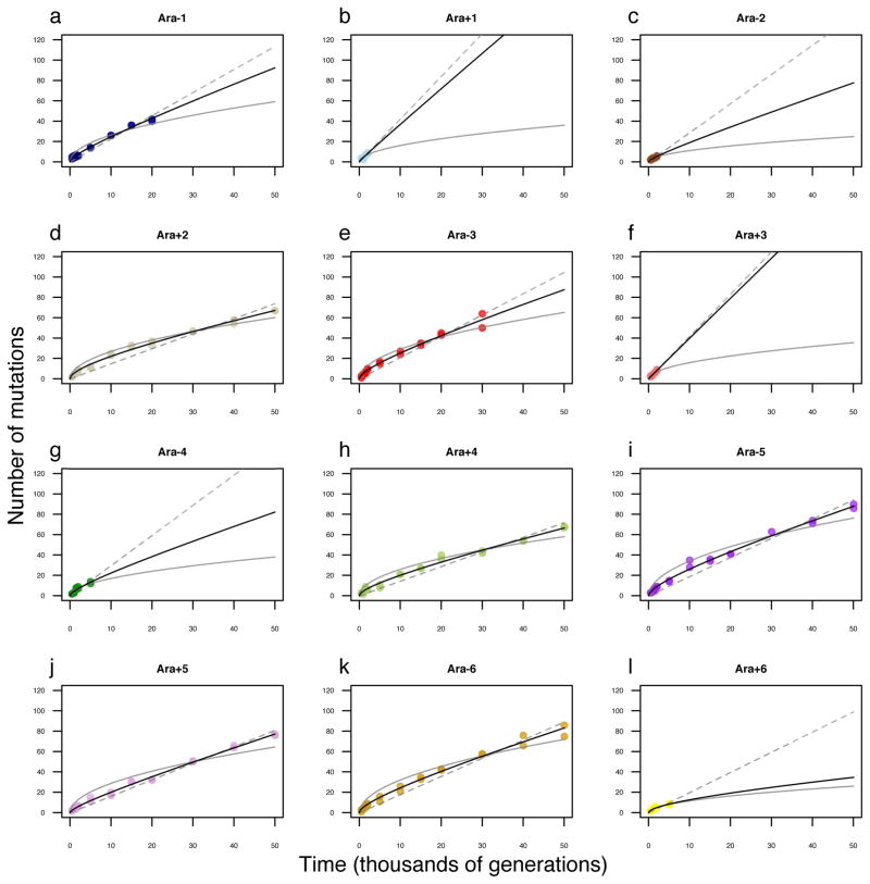
Extended Data Figure 3. Alternative models fit to trajectory of genome evolution for each LTEE population.
a, Ara−1. b, Ara+1. c, Ara−2. d, Ara+2. e, Ara−3. f, Ara+3. g, Ara−4. h, Ara+4. i, Ara−5. j, Ara+5. k, Ara−6. l, Ara+6. Each symbol shows the total mutations in a sequenced genome; in many cases, the symbols for the two genomes from the same population and generation are not distinguishable because they have the same, or almost the same, number of mutations. For the populations that evolved hypermutability, data are shown only for time points before mutators arose. In each panel, the dashed grey line shows the best fit to the linear model; the solid grey curve shows the best fit to the square-root model; and the solid black curve shows the best fit to the composite model with both linear and square-root terms.

