
Fig. 1.
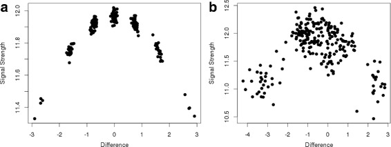
Example probe. Example of genotype values for a hexaploid probe and 228 samples. The x-axis shows the difference between the signals of the two alleles. The y-axis shows the average signal strength per sample. The left and right sides show simulated and real data, respectively. a The simulation demonstrates how the seven genotype classes cluster into groups. b The real data shows the full segregation over the whole spectrum, but no clustering into seven genotype classes