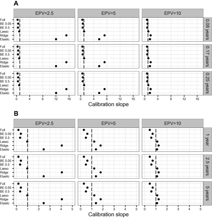
Figure 2.
Average calibration slopes across simulations using different models
Average calibration slopes of simulated datasets were calculated using different models in scenario 1 (A) and scenario 2 (B), respectively. Dashed line depicts ideal calibration slope of 1. See legend of Figure 1 for more details of the models used and the scenarios examined.

