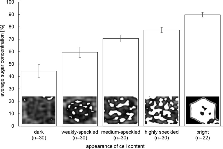
Fig 1. Visual categories of cell content density patterns.
Average ± S.D. sugar concentrations (in %) for 22–30 cells per category is shown. The sugar concentrations in the various visual categories of cell content density were normally distributed (Anderson-Darling: P ≥ 0.07) and thus compared with an ANOVA. All categories of sugar concentrations were significantly different from each other (post-hoc Scheffé multiple comparison tests: P < 0.001).

