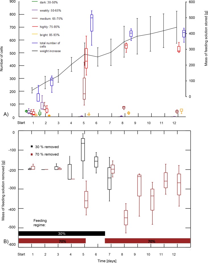
Fig 7.
A) Number of cells filled with content of different sugar concentrations (see Fig 1) and mass of stored solution over time (average ± S.D.). Box plots represent median, first and third quartiles as well as range. B) Mass of feeding solutions (30% and 70% sugar concentration) removed from the feeders over time. Box plots represent median, first and third quartiles as well as range. The horizontal bars in the lower part of the graph illustrate the feeding regime.

