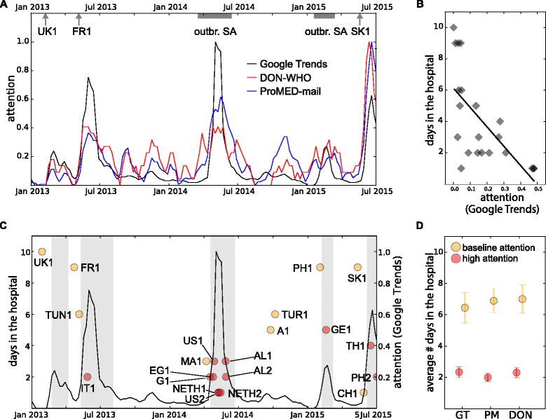
Fig. 6.

Relation between attention and time from hospitalisation to isolation. a Attention as measured by Google Trends, ProMED-mail and DON-WHO from January 2013 to July 2015. Dates corresponding to specific epidemic events are shown on the top of the plot. b Duration of hospitalisation versus attention (from the Google Trends indicator) at the time of admission to the hospital. c Timeline of attention (Google Trends, right axis) and duration from hospitalisation to isolation for each imported case (left axis), at the time of admission to the hospital. Periods of high attention are indicated by vertical shaded areas. Importation events are coloured according to attention level at their time of hospitalisation (red for high attention, orange otherwise). d Average duration from hospitalisation to isolation in periods of high and baseline attention for three indicators (GT= Google Trends, DON= Don of WHO, PM= ProMED-mail). Error bars show standard errors
