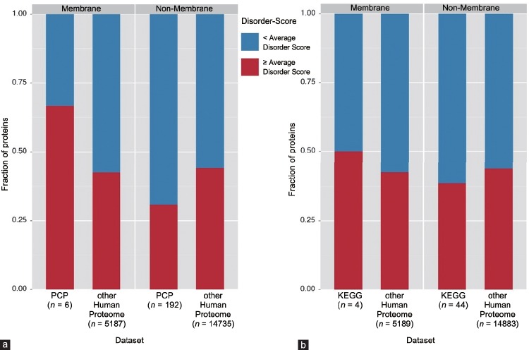
Figure 2.
Bar graphs presenting data from Supplementary Tables 2 (153.9KB, tif) –5 (153.9KB, tif) . These graphs represent analyzed datasets that were split up into the membrane and nonmembrane groups, in which each bar represents either data for the human proteome, or the Russian (PCP) dataset (a), or KEGG dataset (b) within their respective group. The red section of each bar represents the fraction of proteins that have per-protein average disorder score ≥ AVG and the blue sections represent the fraction of proteins that have per-protein average disorder score < AVG.

