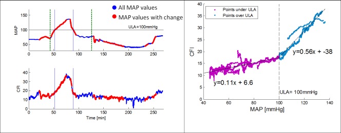
Fig 5.
Left—MAP and CFI data over time throughout the study. MAP was increased to 140mmHg followed by a return to baseline and a decrease to 40mmHg. Dashed green lines represent initial injections of Phnylephrine and Nitroprusside respectively. Blue points represent all MAP values. Red points are associated with periods in which the algorithm identified a significant MAP change and a correlation index (ARI) can be calculated. Right—Scatter plot of CFI versus MAP revealing two distinct slopes obtained for values under of over 100mmHg. This point was defined as the upper limit of autoregulation (ULA).

