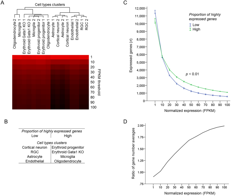
Figure 4. Cell types differing in the proportion of highly expressed genes segregate into clusters.
(A) Dendrogram of cell types segregated into two upper hierarchy clusters based on proportion of highly expressed genes, by hierarchical clustering analysis of number of expressed genes at increasing normalized expression (FPKM) thresholds for different cell types. Uncentered Pearson correlation and centroid linkage with Gene Cluster 3.0 and visualization with Java Treeview 1.1.6r4. Number of genes is color coded, ranging from high (red) to low (black). (B) Summary of cell types’ clusters segregated in C based on patterns in proportion of highly expressed genes. (C) Number of expressed genes plotted across increasing normalized expression (FPKM) thresholds for the two groups of cell types that segregated in B based on proportion of highly expressed genes, as marked (2 groups, 4 cell types x 2 replicates each, mean ± SEM shown; p < 0.01 by ANOVA with repeated measures, posthoc LSD). (D) Ratio of expressed genes number averages in groups with high to low proportion of highly expressed genes (i.e., average number of genes expressed at a certain FKPM threshold in cell types comprising each cluster is used for ratio calculation), plotted across increasing normalized expression (FPKM) thresholds.

