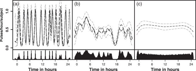
Fig. 2.
Simulated and fitted intensity function for a randomly selected simulation
for each model: (a) Strong clustering, (b) Weaker clustering, and (c) No
clustering. Each simulated dataset had 26 subjects. The top panel represents
the true intensity function (solid line) and the estimated intensity
function (dashed line). The gray lines are the 10% and 90% pointwise
credible intervals. The height of the peaks is  . The width of the peaks is
 The peak center locations make up
 . The second panel shows the posterior
distributions of the estimated cluster
centers.

