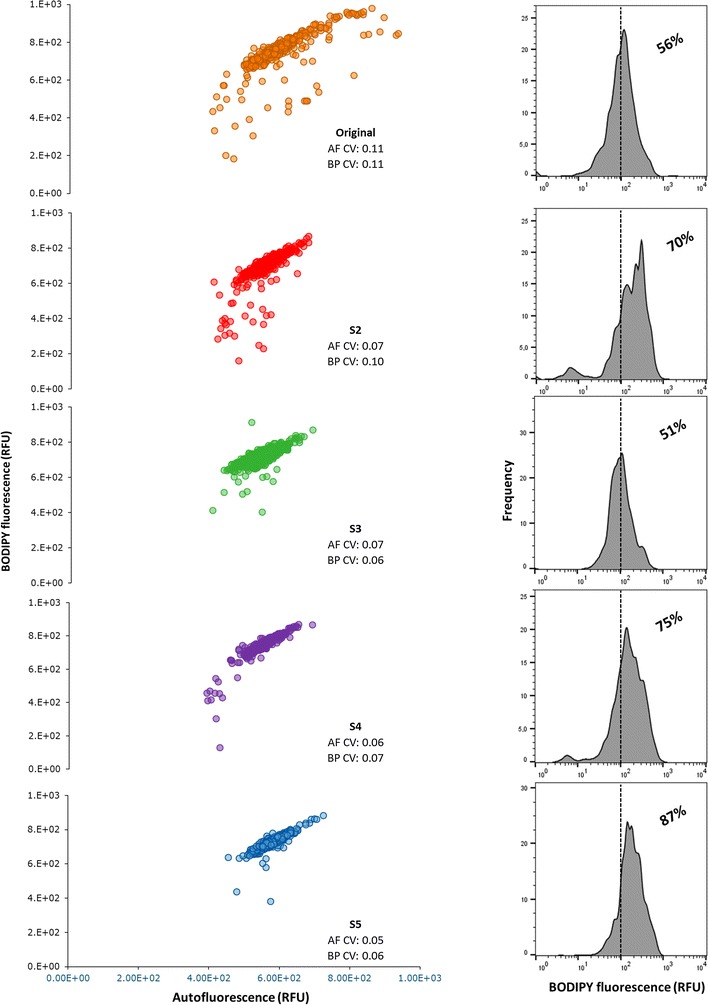
Fig. 4.

Sorted populations show a progressive increase in lipid productivity due to an increase in the proportion of lipid-rich cells within the populations. Scatter plots represent the relation between autofluorescence (AF, x-axis) and lipid fluorescence (BP, y-axis). On all scatter-plots the coefficient of variation (CV) of both AF and BP are depicted. Each populations has a histogram plotted showing the frequency distribution of lipid fluorescence (BP, x-axis). Additionally, each histogram is market to show the percentage of cells that have fluorescence signal above 10^2. All graphs represent the readings of 1000 cells
