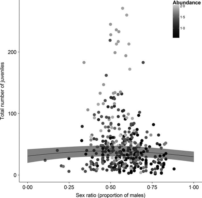
Figure 5.

Association between the number of juveniles recorded at each CE site in each year and the estimated proportion of males. The colour of the points indicates the (log) predicted relative abundance at each site. Grey line shows the predicted relationship from a GLMM (Table 2), with 95% CIs (shaded areas).
