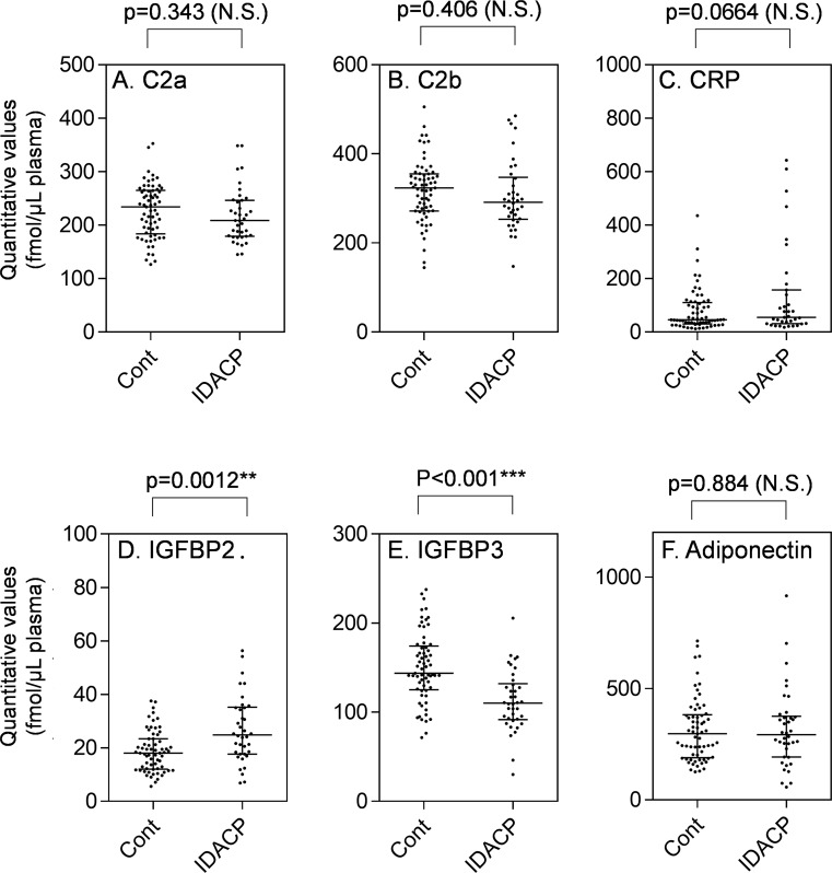
Fig 3. Dot plot showing the differences of IDACP marker candidate between healthy controls (n = 65) and early-stage IDACP (n = 38) in the early-stage set.
Each dot represents the protein level in an individual sample, and lines represent median and quartiles. N.S., no significant difference. Cont, healthy controls.

