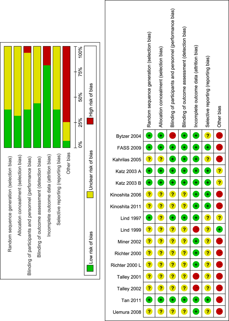
Figure 2. Risk of bias graph and summary.
Green for low risk of bias, yellow for unclear risk of bias and red for high risk of bias. The left (risk of bias graph) shows an overall risk of bias of each domain. For example, the length of green rectangle means the number of studies being assessed as low risk of risk. The right (risk of bias summary) indicates the risk of bias of each domain in each study.

