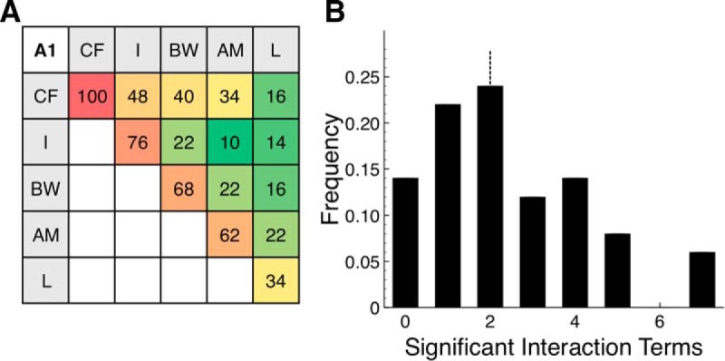
Figure 4.

Population analysis of A1 neurons. A, Percent of neurons driven by each significant term. Red represents highest value (100%). Green represents lowest value (10%). Lower triangle is symmetric to upper triangle and is left blank. B, Histogram of number of significant interaction terms per neuron. Median number of significant interaction terms was 2, shown by dashed vertical line.
