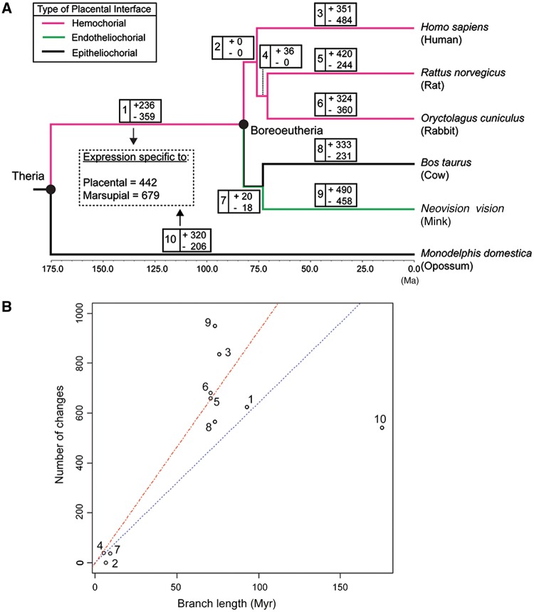
Fig. 5.—
Changes in gene expression shown on the mammalian time tree. (A) The number of genes gained (+) or lost (−) on each branch reconstructed by ancThresh is shown. Branch colors represent the types of placentation associated with each branch. (B) The plot showing the relationship between the branch length and the total number of changes in gene expression (the sum of gene expression gain and loss). The numbers on the dots correspond to the branch numbers as appear on (A). The blue dotted line is the linear regression line through the origin for all the data points, whereas the red dashed line is the linear regression line through the origin only for data points from eutherian mammals (i.e., excluding the opossum branch, #10). The slope for the blue dotted line is 6.5 changes/Myr, and that for the red dashed line is 9.4 changes/Myr.

