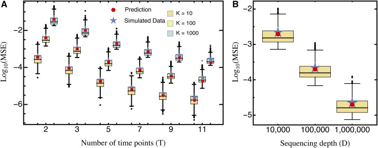
Figure 1.
Comparison of the predicted mean squared error (Equation 10; red circles) and the average mean squared error (blue stars), obtained from simulated data sets for (A) different numbers of sampling time points T and mutants K, for sequencing depth and (B) different sequencing depth D, with fixed Boxes represent the interquartile range (i.e., the 50% C.I.), whiskers extend to the highest/lowest data point within the box 1.5 times the interquartile range, and black and gray circles represent close and far outliers, respectively. Results are presented on log scale.

