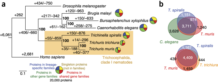
Figure 2. Comparative genomics of Trichuris species.
(a) Phylogenetic analysis of genome content. The tree shown is a maximum-likelihood phylogeny based on a concatenated alignment of single-copy orthologs. Values on edges represent the inferred numbers of births (+) and deaths (−) of gene families along that edge. The scale bar shows expected number of amino acid substitutions per residue. Pie charts represent the gene family composition of each genome: the area of the circle is proportional to the predicted proteome size, and wedges represent the numbers of proteins predicted to be either singletons (not members of any gene family; yellow), members of families common to the eight genomes (red), members of gene families present only in a single genome (blue) and members of all other gene families (green). (b) Euler diagrams of shared presence and absence of gene families in clade I nematodes and the model nematode C. elegans. Note that the approach in a cannot distinguish the polarity of changes at the base of the tree; thus, for example, the value of 262 gene family gains on the basal branch will include gene families lost on the branch leading to Homo sapiens.

