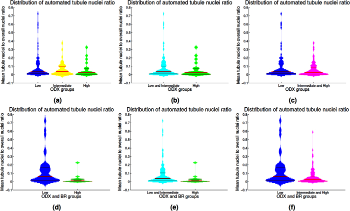
Figure 7. Violin plots depicting the mean tubule nuclei ratio in high power fields extracted from the different ODX risk groups.
The histogram associated to each violin plot is smoothed using a normal kernel. Red lines in the violin plot show the location of the lower quartile (q1), the median and the upper quartile (q3). Low (blue), intermediate (yellow) and high (green) ODX groups are shown in the top row (a). The distribution of the low and intermediate groups (cyan) against the high ODX group is presented in (b). The low group against the intermediate and high ODX groups (magenta) are presented in (c). The distribution for the groups with low ODX-low grade and high ODX-high grade are depicted in (d). High ODX-high grade against all the other BCa cases and low ODX-low grade against all the other BCa cases are presented in (e) and (f) respectively.

