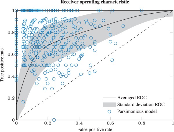
Fig. 4.

Averaged ROC curve. For each of the N = 500 runs, the ROC curve is calculated in dependence of λ. The black line depicts the arithmetic mean ROC curve and the shading the standard deviation. Blue circles denote the selected model for each repetition. Because the dots appear on average near the maximum of sensitivity and specificity (upper left corner), we consider the LRT based selection criterion as appropriate. The points and are the limiting cases of no and all, respectively, parameters cell type-specific
