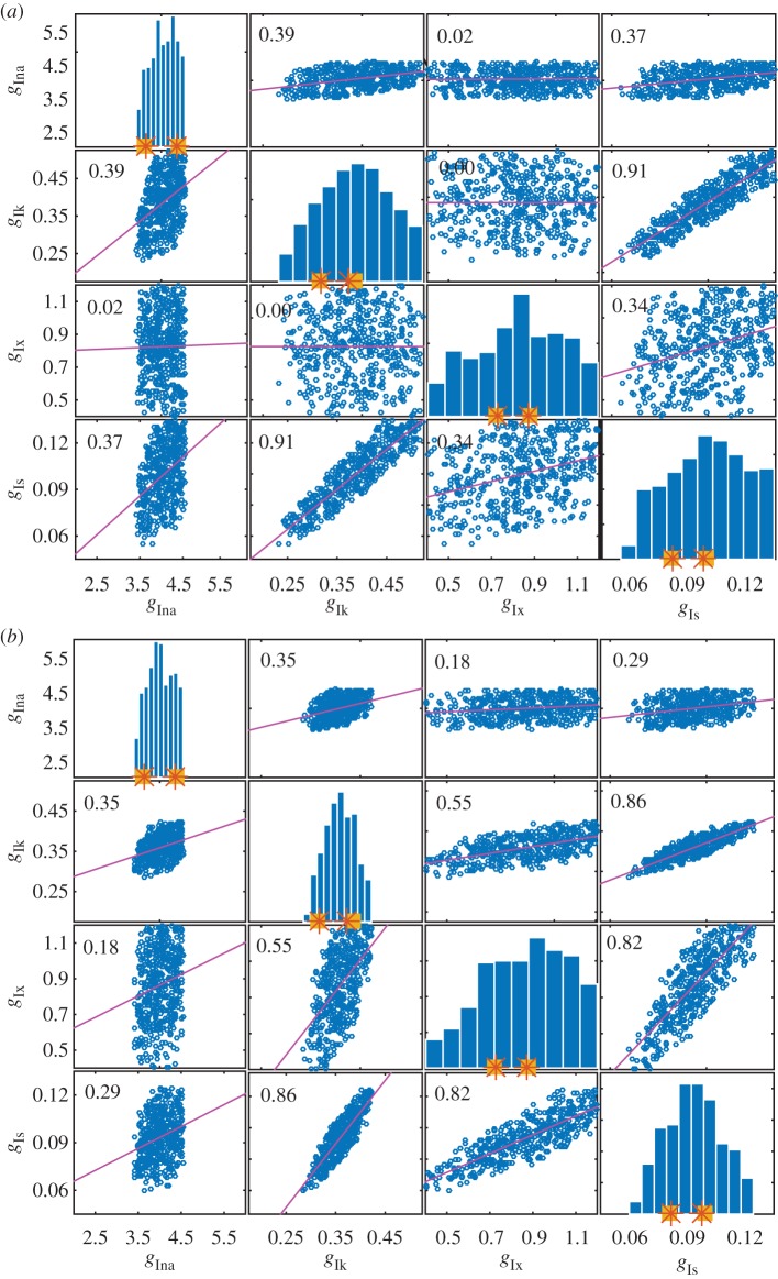
Figure 4.
Histograms and correlation plots from the SMC POM for parameter set 4. In each histogram, the squares denote the interval from which the generated data for the considered parameter was sampled. The stars denote the actual minimum and maximum values of the parameter used to generate the data. The range of the x-axis gives the range of the parameter space explored. (a) Results obtained with the biomarker statistics. (b) Results obtained with the biomarker/time statistics. (Online version in colour.)

