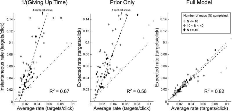
Figure 7.
Plots of participants’ median rate when quitting trials vs. their average rates in Experiment 1, for various models. Each diamond represents a participant, with color coding the number of maps that participant completed (out of 50). The dotted line indicates the identity (1:1) line: if participants left the patch when their expected rate was exactly the average rate, then all points would lie along this line. Dashed lines are the best linear fit to the data; R2 for each fit is given on the graph.

