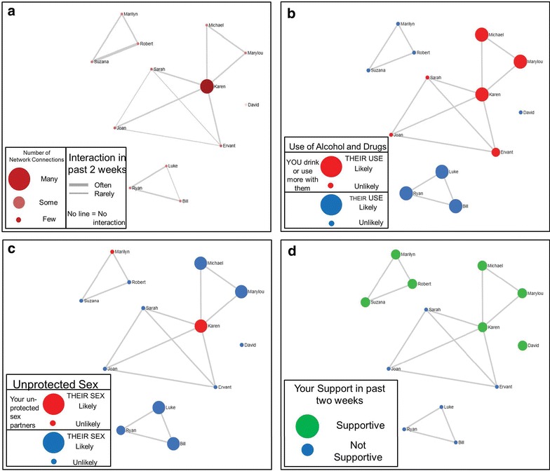
Fig. 1.

Example figures from hypothetical MNI session. Network contacts are represented by circles (graph “nodes”) and lines between nodes represent network contacts who interacted with each other in the past 2 weeks. The layout of the nodes, generated with the Fruchterman–Reingold force-directed placement algorithm highlights structural characteristics of the network, such as isolates (completely disconnected nodes) and components (a set of nodes tied together but disconnected from other nodes). The structural layout is consistent across the 4 diagrams. The figure in the upper left (a) uses node color and size, and line thickness to highlight other characteristics of the network structure, including the centrality of network actors (depicted by larger and darker nodes) and stronger relationship ties between actors (highlighted with thicker lines). The other figures use node size and color to highlight network composition. The figure in the upper right (b) highlights the likelihood of AOD use by network members with size (larger = likely, smaller = unlikely) and increased resident use when with network member by color (red drink or use more drugs with, and blue typical use). The figure in the lower left (c) highlights perceived risky sex by network members with node size (larger = likely, smaller = unlikely) and unprotected sex with network members with color (red had unprotected sex with, and blue did not have unprotected sex with). The figure in the lower right hand (d) depicts supportive network members with size and color (large and green supportive, small and blue not supportive)
