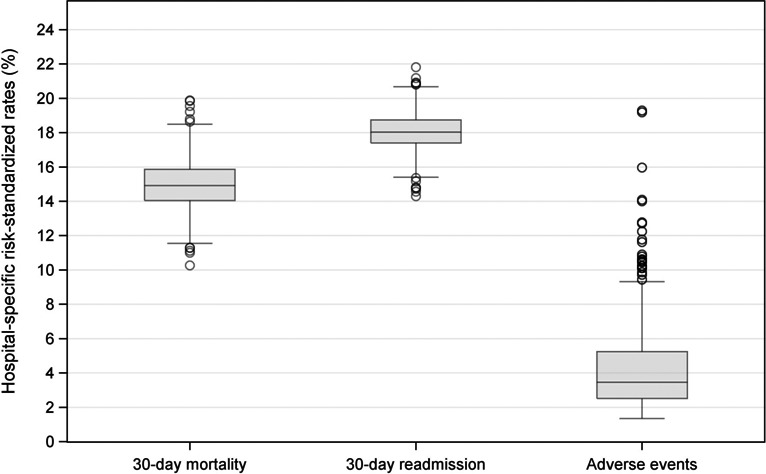
Figure 2.

Box and whisker plots of the distributions of hospital‐specific 30‐day all‐cause risk‐standardized mortality and unplanned readmission rates and hospital‐specific risk‐standardized occurrence rates of adverse events for which patients were at risk. The length of the box represents the interquartile range (IQR), the horizontal line in the box interior represents the median, the whiskers represent the 1.5 IQR of the 25th quartile or 1.5 IQR of the 75th quartile, and the dots represent outliers. For mortality, unplanned readmission, and adverse events, respectively, the ranges (minimum to maximum) of risk‐standardized rates were 10.3% to 19.9%, 14.3% to 21.8%, and 1.4% to 19.3%.
