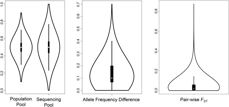
Figure 2.
Summary violin plots of the FST null distribution and false discovery rate simulation. The left plots show the allele frequency distribution of population and sequencing pools. The middle plot represents the difference between two randomly sampled allele frequencies drawn from the sequencing pool. The right plot shows the distribution of FST values calculated from the distribution of allele frequency differences.

