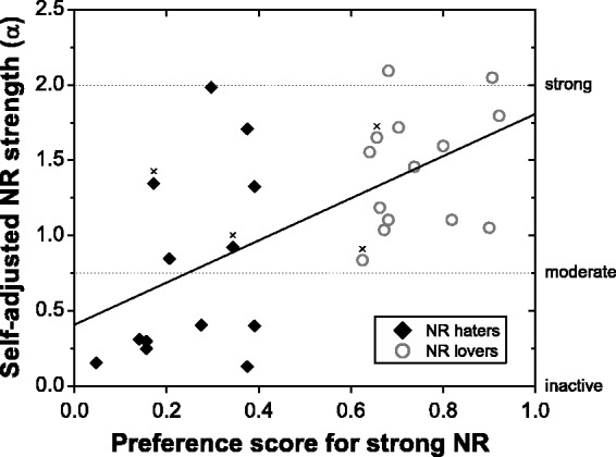
Figure 6.

Scatter plot of aggregate preference scores for strong NR derived from the data from the two previous studies against self-adjusted NR strengths averaged across 0 and 4 dB SNR from the current study. The black solid line shows the least-squares linear fit. Data points marked by the × symbols correspond to the four participants with “borderline” preference scores (see Participants section for details). α-values corresponding to the inactive, moderate, and strong NR settings are also indicated.
