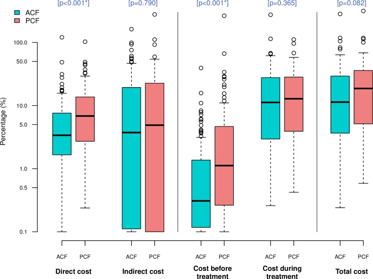
Fig 2. Comparison of cost as percentage of reported annual household income between ACF and PCF.
Box-and-whisker plots indicate the median, 25th and 75th centiles, and the range of values. All values less than 0.1 were converted to 0.1 in order to use a log scale for the y-axis. *Significant difference (P<0.05).

