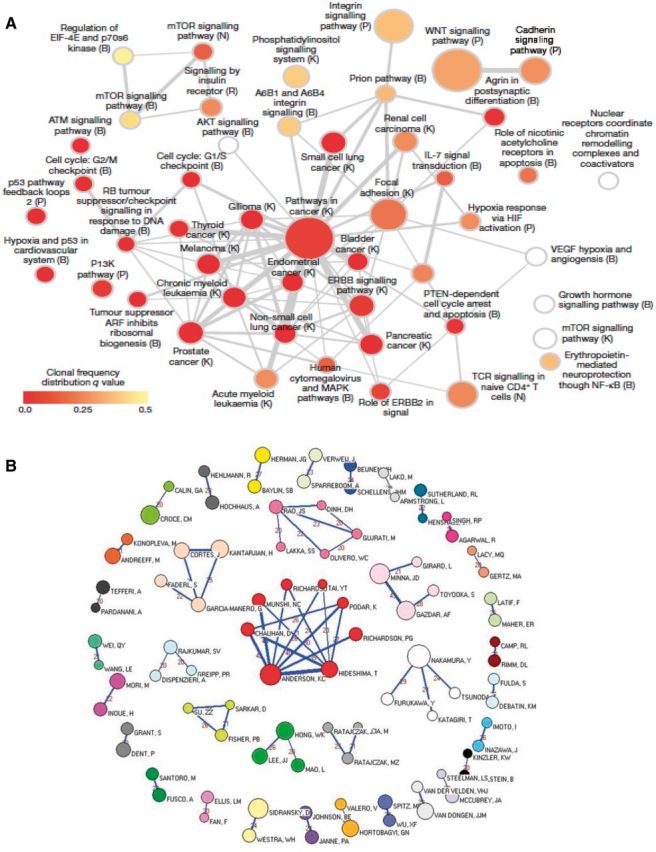
Figure 7.

Network graphs as examples of graphical representations to illustrate connectedness and relatedness in cancer. A) Network analysis of recurrently mutated genes in triple-negative breast cancer (47). This network analysis diagram shows significantly overrepresented pathways defined from genes mutated across multiple patients. Color indicates the frequency of clones in individual patients and the size of node the frequency across patients of that group of mutations. B) Network graph representing the 36 cohesive oncology co-authorship network, 2001–2010 reproduced from Shao et al. Analysis of oncology research from 2001 to 2010: a scientometric perspective (48). One vertex represents one author. The vertex size is proportional to the productivity of the author while the thickness of the lines indicates the strength of connection between two authors. The thicker the line between the two vertices, the closer the relationship is. The value between two vertices represents the frequency of cooperation instances.
