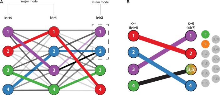
Fig. 2.
pong’s back-end model for the alignment of Q matrices, shown here from clustering inference with ADMIXTURE (Alexander et al., 2009) applied to 1000 Genomes data (phase 3; Consortium, 2015). Panel labels correspond to panels in Figure 1, and numbers in graph vertices correspond to the clusters labeled in Figure 1. (A) Characterizing modes from three runs of clustering inference at K = 4, the smallest K value with multiple modes for this dataset. Edge thickness corresponds to the value of pong’s default cluster similarity metric (derived from Jaccard’s index; see Supplementary Materials), while edge opacity ranks connections for a cluster in run k4r4 to a cluster in run k4r3 (or in run k4r10). Note that both cluster 2 and 3 in k4r4 are most similar based on metric to cluster 2 in k4r3; in order to find the maximum-weight perfect matching between the runs, pong matches cluster 3 in k4r4 with cluster 1 in k4r3. Bold labels indicate representative runs for the two modes. Seven other runs (not displayed for ease of visualization) are grouped in the same mode as k4r4 and k4r10; these nine runs comprise the major mode at K = 4 (Fig. 1A). k4r3 is the only run in the minor mode (Fig. 1A). (B) Alignment of representative runs for the major modes at K = 4 to K = 5. alignments are constructed between k4r4 and k5r7 (the representative run of the major mode at K = 5), constrained by the use of exactly one union node at K = 5. Of these 10 alignments, the alignment with maximum edge weight is shown and matches cluster 4 in k4r4 to the sum of clusters 3 and 5 in k5r7. The best matching for all other clusters are shown and informs the coloring of pong’s visualization (see Fig. 1B)

