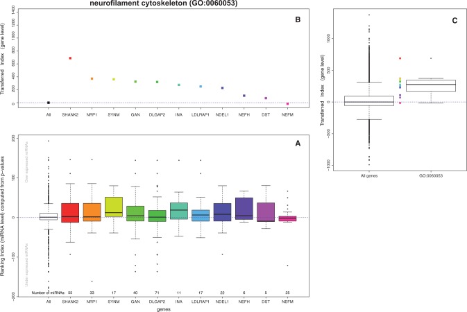
Fig. 3.
Example diagram of the analysis steps for the neurofilament cytoskeleton GO term (GO:0060053). Plot (A) represents the distribution of the ranking index computed as described in Equation 1. The white box shows the distribution for all miRNAs in the study. In our case, positive values belong to those miRNAs more expressed in tumors while the negative relate to miRNAs more expressed in controls. Each of the colored boxes represents the same index, but just for the subset of miRNAs targeting one gene in the GO. Plot (B) represents the gene transferred index introduced in Equation 2. For each of the genes in the GO term all miRNA level indexes are added up into a unique value. Each of the dots in plot B represents the gene level transferred index computed from the microRNAs represented in the boxplot underneath (plot A). Plot (C) displays the distribution of the transferred index for the whole genome (left box) and for the genes within the neurofilament cytoskeleton GO term (right box and dots). Here, we can appreciate how the overall distribution of the genes in the GO term is higher that the basal distribution of all genes. The logistic regression model spots this pattern and reports the GO term as enriched in tumor samples, meaning that the neurofilament cytoskeleton cellular component is more intercepted by miRNA action in cases than in controls

