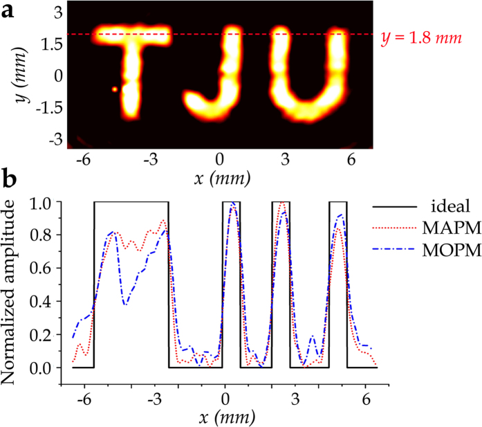
Figure 6. Quantitative analysis.
(a) Illustration of the quantitative analysis setting, where the red dashed line represents the cross-section of y = 1.8 mm. (b) Normalized amplitude distributions of the cross-section of y = 1.8 mm, which has been marked in a. The black solid line shows the ideal amplitude distribution. The red dotted line and the blue dash-dotted line represent the experimental results corresponding to MAPM and MOPM, respectively.

