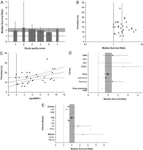
Figure 6.

Thymidine kinase/HSV‐1 with ganciclovir (GCV) subset analysis. A. Stratification by aggregated quality score did not account for between‐study heterogeneity (p > 0.0019). The grey band represents global 95% confidence intervals (CIs); columns represent mean ± 95% CI and column width a measure of number of comparisons within each stratum. The solid line represents the level of neutral treatment effect. B. Funnel plots showing effect size (x‐axis) versus a measure of study precision (y‐axis). The dataset appears to be skewed, with imprecise studies generally showing more efficacy than those with larger sample sizes. The solid line represents the line of neutral treatment effect and the dotted line marks the global efficacy estimate. C. Egger regression plot depicting effect size*precision (x‐axis) versus precision (y‐axis). Regression revealed a positive intercept (p < 0.001). The vertical solid line represents the level of neutral treatment effect; dotted lines represent 95% CI of the regression. D. The vector used to deliver gene therapy was not associated with between‐study heterogeneity (p > 0.0019). E. The tumour line used accounted for heterogeneity (p < 0.0019), with RSV‐M, BT4C and C6 lines associated with greatest efficacy. However, we observed no difference in efficacy between cells originating from different species (p > 0.0019). The grey bands in D–E represent global 95% CIs; plots represent mean ± 95% CI and the diamond represents a measure of number of comparisons within each stratum. The dotted line represents the level of neutral treatment effect.
