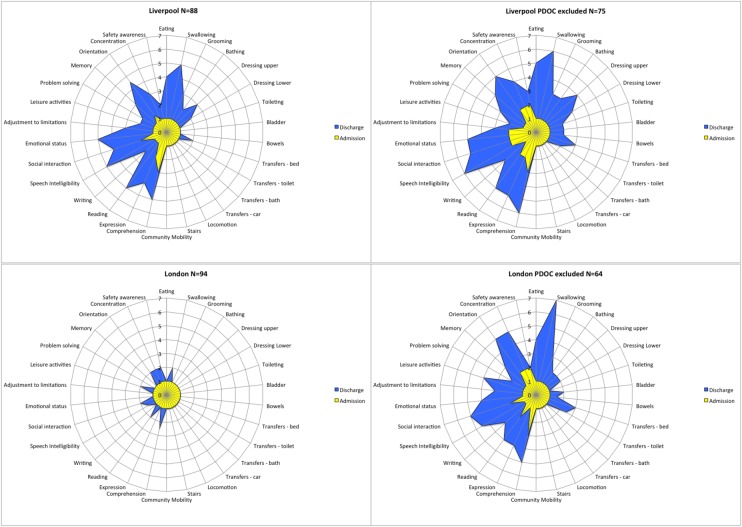
Figure 4.
Composite FAM-Splats for the two units: median scores at admission and discharge. The radar chart (or ‘FAM splat’) provides a graphic representation of the disability profile from the FIM+FAM data. The 30-scale items are arranged as spokes of a wheel. Scoring levels from 1 (total dependence) to 7 (total independence) run from the centre outwards. Thus, a perfect score would be demonstrated as a large circle. These composite radar charts illustrate the median scores on admission and discharge for the two units. The yellow-shaded portion represents the median scores on admission for each item. The blue-shaded area represents the change in median score from admission to discharge. Clear differences in the pattern of disability can be seen between the two centres.

