
Figure 2.
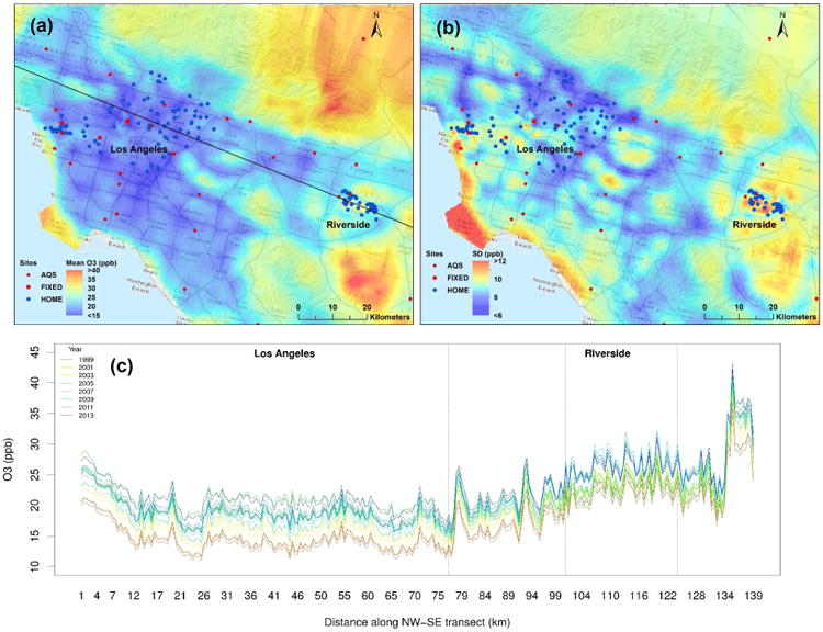
(a) Map of predicted long-term average and (b) map of standard deviation of ozone in Los Angeles and Riverside from 1999 to 2013. (c) Annual average predicted concentrations across the transect shown in Figure 2a (black line, NW to SE), though the counties of Los Angeles and Riverside from 1999 to 2013.