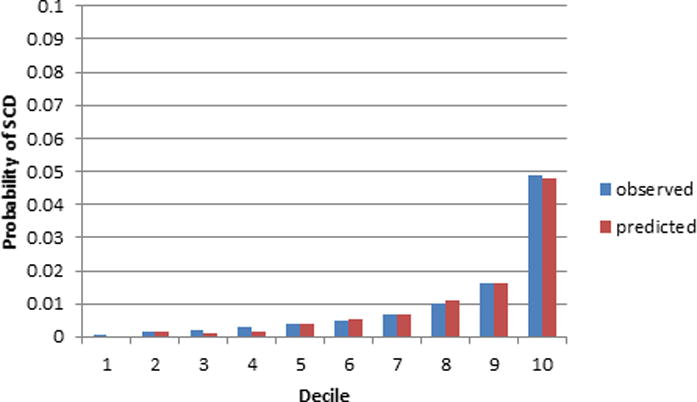
Figure 2A. ARIC 10 year calibration plot using the SCD prediction model.

The x-axis refers to deciles of predicted SCD risk. Each bar in the graph represents the average observed and predicted SCD risk.

The x-axis refers to deciles of predicted SCD risk. Each bar in the graph represents the average observed and predicted SCD risk.