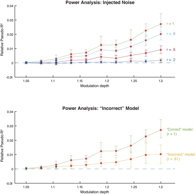
Fig. 10.
Power analysis. Both plots show marginal predictive power of relevance as a function of its simulated modulation depth. Red points indicate that the marginal predictive power is significantly greater than zero; blue points indicate that it is not significantly greater than zero. Error bars are bootstrapped 95% confidence intervals. A: injected noise analysis. After simulating the neural data, we corrupted the relevance model with varying degrees of noise and then fit the model. Each line represents the model fits for a different level of added noise. The r values indicate the correlation between the original model covariates and the corrupted model covariates. B: “Incorrect” model analysis. We simulated neural data using edge energy and fit the model using the relevance model (yellow line). For comparison, we include the model fits when the “correct” model, relevance, was used to simulate the spikes (green line).

