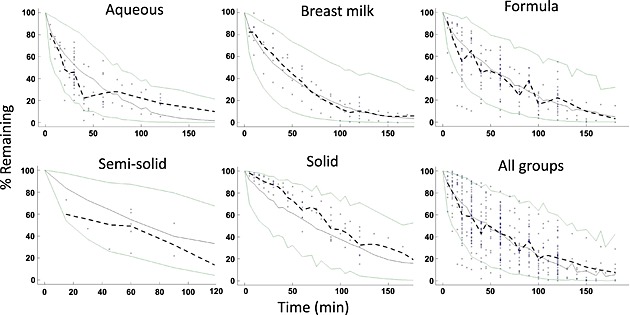
Figure 2.

Visual predictive check plots. The green lines represent 2.5th and 97.5th percentiles of model‐predicted data. The solid grey line represents the 50th percentile of model‐predicted data. The dashed black line represents the median of the observed data
