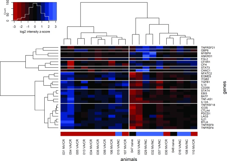
Fig 5. Heat map of signal intensities for selected probes.
The ordering of the probes (rows) and animals (columns) is based on an unsupervised cluster analysis. The associated dendrograms are shown to the left and above the heat map. The colors in the heat map represent centered and scaled intensity values. Cells with negative z-scores (intensities lower than the overall mean for any given probe) are shaded red and cells with positive z-scores (higher intensities) are shaded blue. The colored sidebar above the heat map indicates the persistence status of each animal (carriers are shown in red, non-carriers in blue and controls in black).

