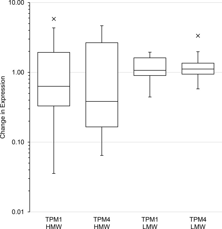
Fig 3. Repeat sampling of individuals with Type 2 diabetes.
Box plot showing difference between repeat samplings of patients with Type 2 diabetes. The box represents the interquartile range and the line inside the box indicates the median change in expression. The whiskers are 1.5 times above and below the interquartile range, with outliers individually plotted.

